ACHD Commuteride
A commute site that starts with where you're going
Commuteride runs a lot of programs: 88 vanpools, ride matching through Share the Ride Idaho, Emergency Ride Home, employer consulting, and campaigns like May in Motion and Ridetober. The old website listed all of them and left each visitor to work out which ones applied to their commute.
Most people do not arrive knowing whether they are a vanpool person or a bus person. They know where they live and where they work. We rebuilt the site so a visitor enters those 2 things and sees the options that fit the trip.
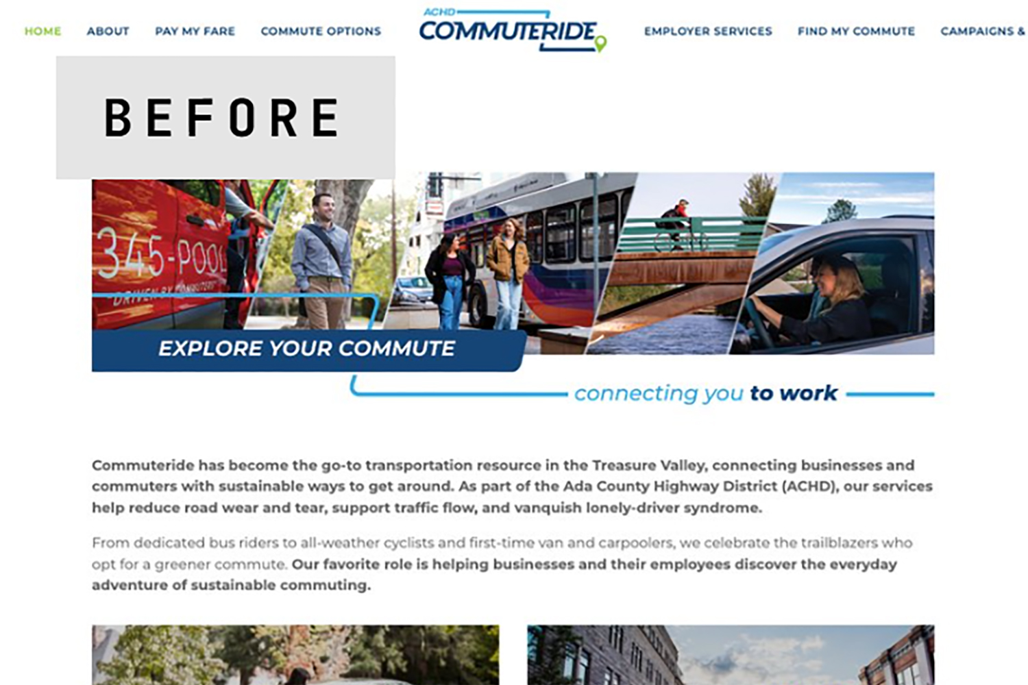
Before our remodel.
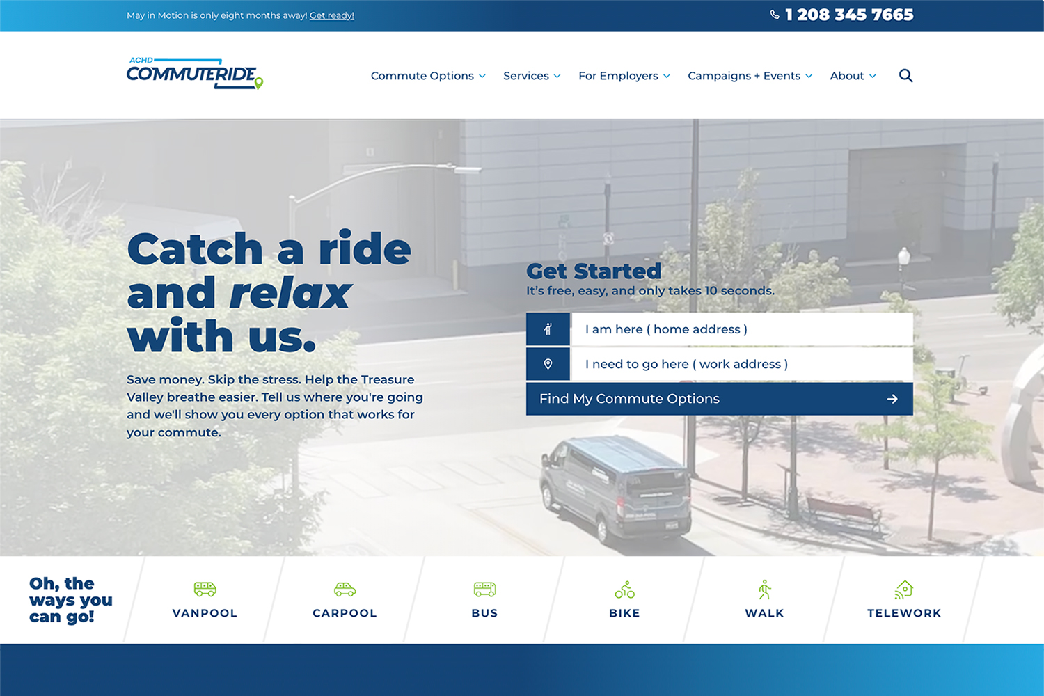
After.
At a Glance
Quick Facts
- Industry: Local Government / Transportation
- Services: Discovery and Customer Journey Mapping, Information Architecture, Website Redesign, WordPress Development, CRM Selection and Form Integration, Analytics Setup, Accessibility Testing, Managed Hosting, Staff Training
- Platform: WordPress, Custom PHP, Brevo
- Compliance: WCAG 2.2 AA, single sign-on with two-factor authentication, IT-approved plugin list, cookie consent
- Timeline: Kickoff in May 2026, launched September 29, 2026
The Challenge
- A Squarespace site last meaningfully updated in 2016 that had grown to 132 pages
- Programs presented as a directory, with no way to see which ones fit a specific commute
- Vanpool inquiries arriving through several different forms
The Approach
- 13 audience journeys mapped before design began
- A From / To commute finder as the main path through the site
- One vanpool inquiry form connected to a new CRM
The Outcome
- 132 pages reduced to 30
- Google Lighthouse accessibility score of 100
- Launched on schedule on September 29, 2026
The Situation
The previous commuteride.com was built on Squarespace and had not been meaningfully updated since 2016. Over the years it grew to 132 pages: a new copy of each campaign page every year, old toolkits, test pages, and pages for events long past.
The larger problem was structure. The homepage worked as a directory of program names: Vanpool, Carpool, Bus, Bike + Walk, Telework. A visitor had to guess which program applied, click in, read, and guess again. Many left without learning that an option even existed for their route.
There were gaps behind the scenes too. Vanpool interest came in through several forms, most of them were not connected to the CRM, and there was no single view of which pages or campaigns led to an inquiry. The site also predated current standards for mobile design and accessibility.
What We Built
A commute finder in place of a program directory
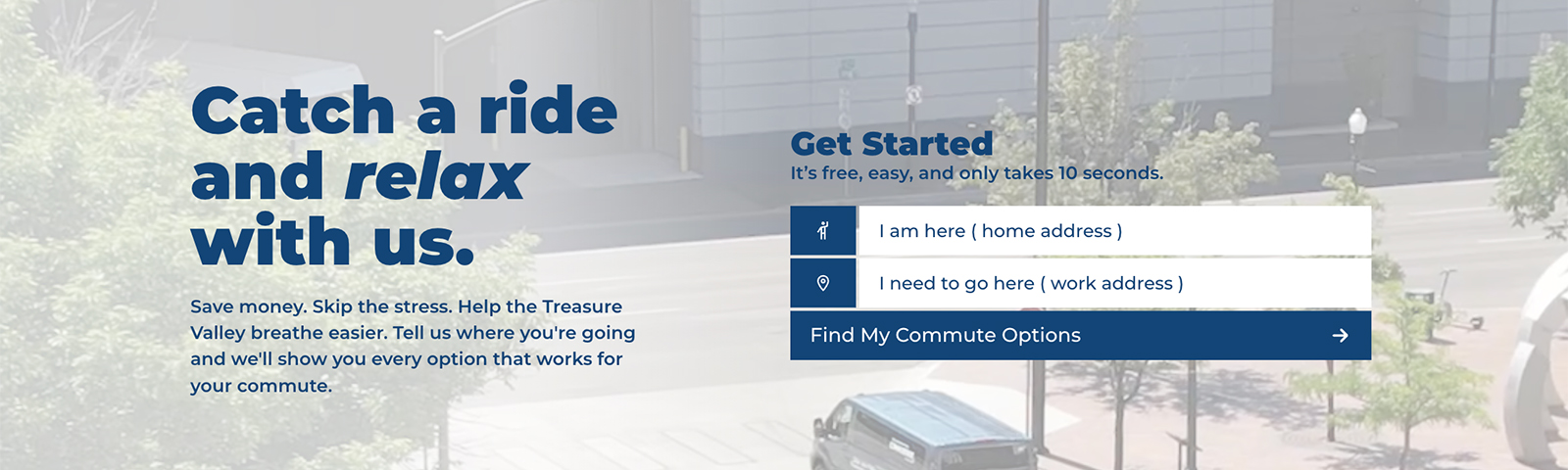
The homepage now leads with 2 fields: Starting from and Going to. The visitor fills in both, selects Find My Commute Options, and the site measures the trip and shows the options that make sense for that distance. A 3-mile commute and a 40-mile commute get different answers.
Each option links to a page that answers the next questions: what it costs, how it works, and what happens if you need to leave work early. Emergency Ride Home appears on every page where it applies, because that worry was the biggest barrier to sharing a ride that we found in discovery.
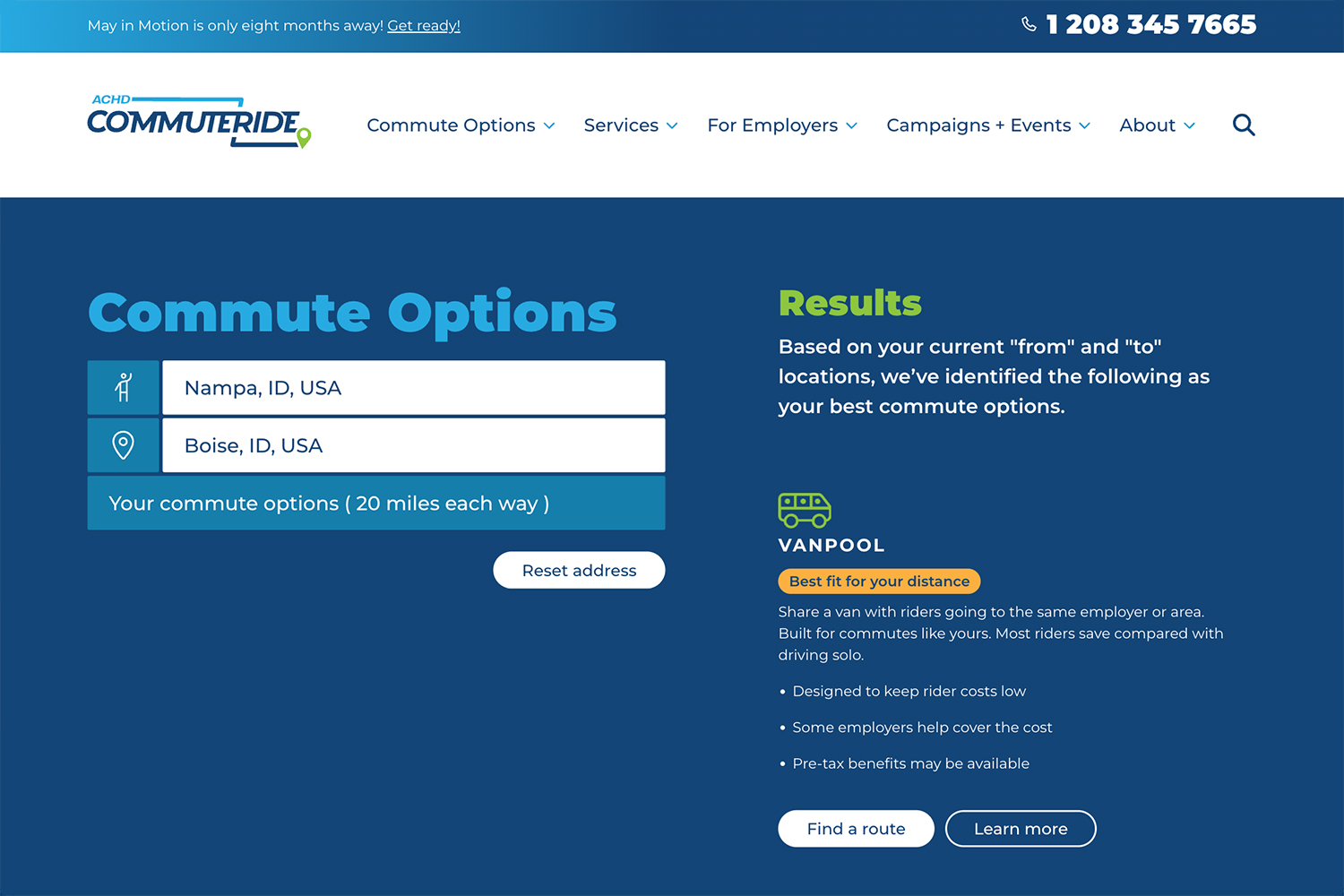
Visitors enter a start and a destination and see the commute options that fit the trip.
Vanpool routes and fares anyone can read
Vanpool is Commuteride's flagship program, so the vanpool page carries the most weight. Visitors pick where they are starting from and see every route from that city, with the destination, start and end times, van number, and monthly fare.
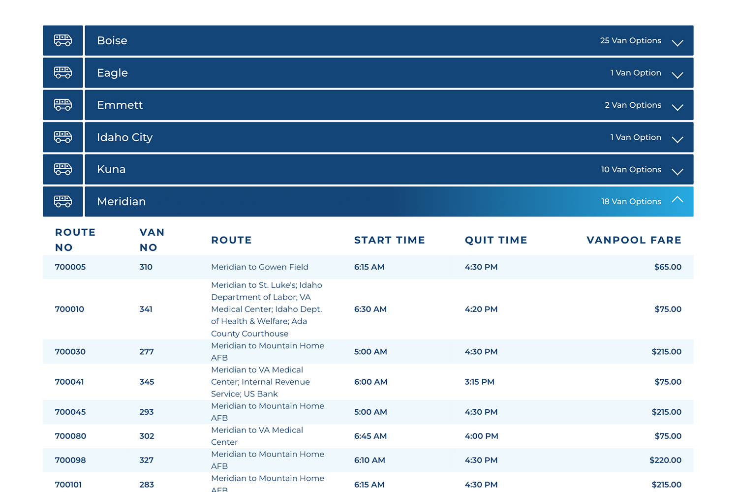
Every vanpool route is listed by starting city with its schedule and monthly fare.
We built the route list so Commuteride staff can update a route or a fare without rebuilding a table by hand. A separate page serves military commuters, since many routes run to Mountain Home Air Force Base and Gowen Field.
On the same page, a commute savings calculator shows what driving alone costs each month. It fills in the current regional fuel price from federal energy data and uses AAA vehicle cost figures, so the comparison starts from real numbers.
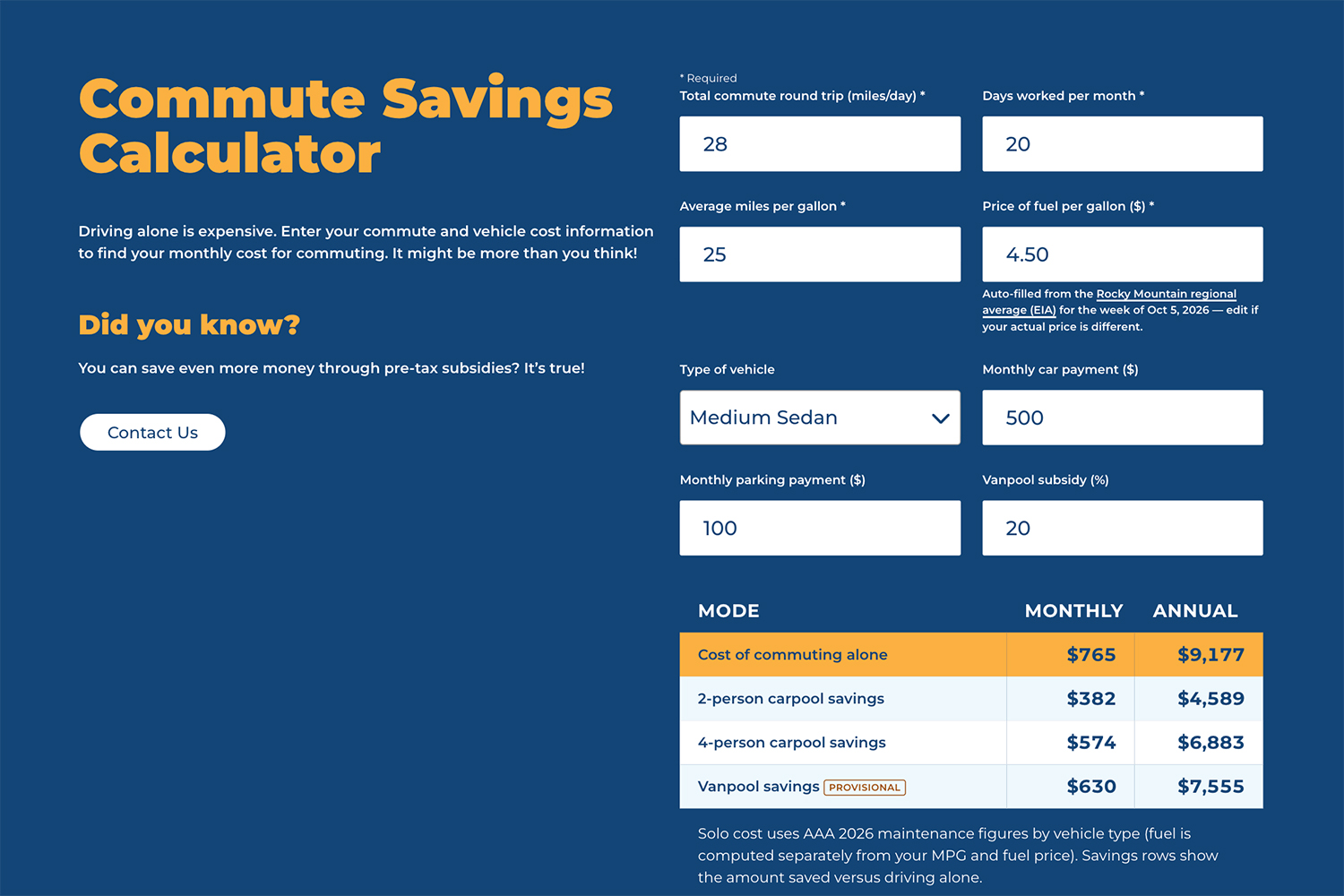
The savings calculator compares the cost of driving alone with carpool and vanpool.
One form for starting a new vanpool
When no existing route fits a commute, the next step for creating a new vanpool route previously was spread across several forms. We walked through the intake process with Commuteride's vanpool formation specialist and replaced those forms with one.
The form asks for the details that staff need to judge whether a new route is workable: start and end points, employer, work hours, schedule flexibility, and whether the person is willing to drive. Each submission is saved on the site, emailed to staff, and sent to the CRM, so every inquiry lands in the same place.
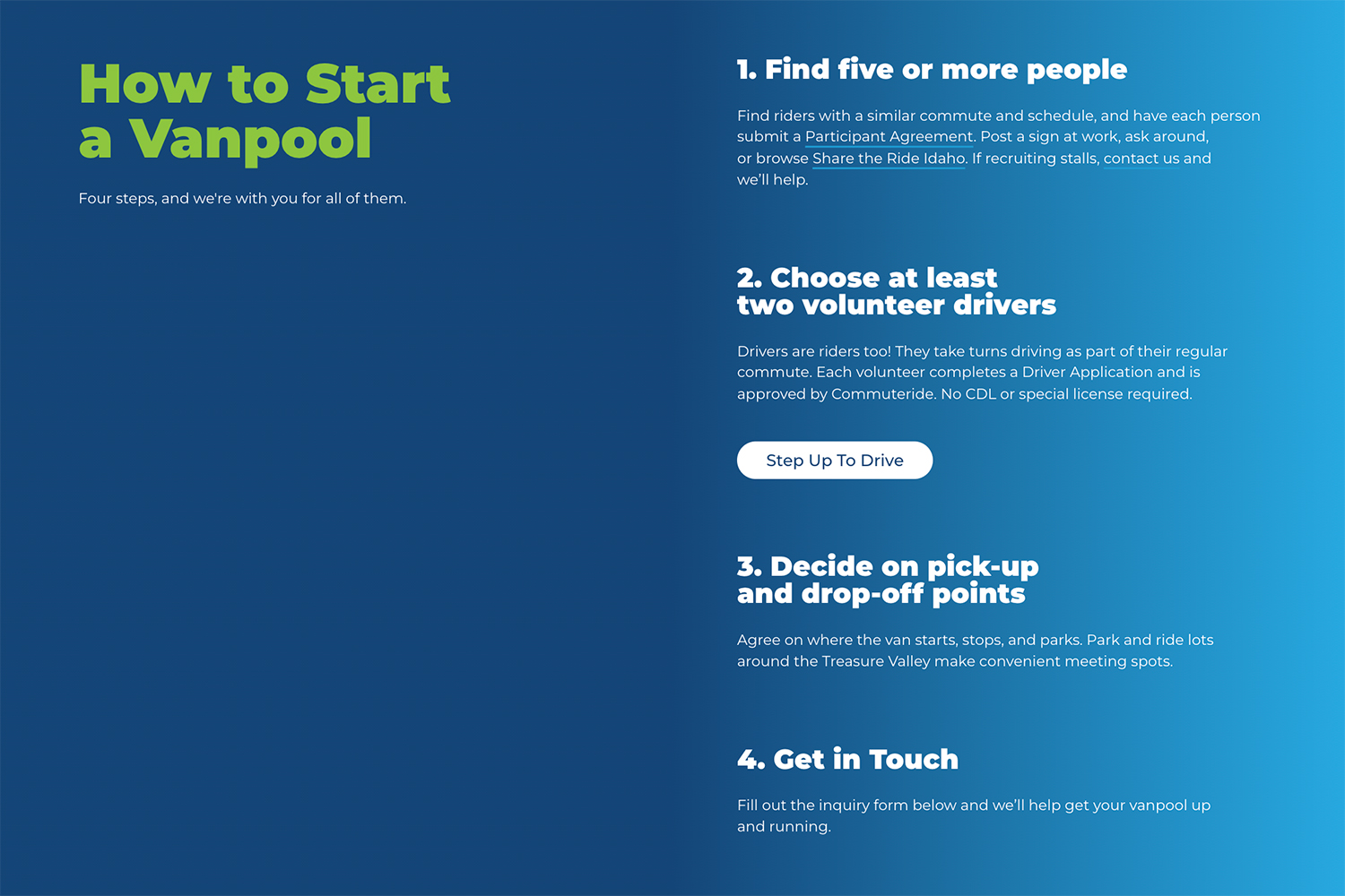
One inquiry form replaced several, and every submission goes to the CRM.
A CRM that fits the budget and analytics that show demand
During discovery we compared an upgrade to ACHD's existing CRM plan with a move to Brevo. ACHD chose Brevo for its lower cost, audience segmentation, and automation. We moved their existing contacts over and connected the site's forms to it.
We also set up Google Tag Manager and GA4 with a documented list of tracked events and a DataStudio dashboard. Each commute search is recorded anonymously, so over time ACHD can see which corridors people are asking about, including corridors that no route serves yet.
30 pages doing the work of 132
We audited all 132 pages with the Commuteride team and kept, combined, or retired each one. May in Motion and Ridetober are now single pages with their own event listings, so a new campaign year means new events and no new pages.
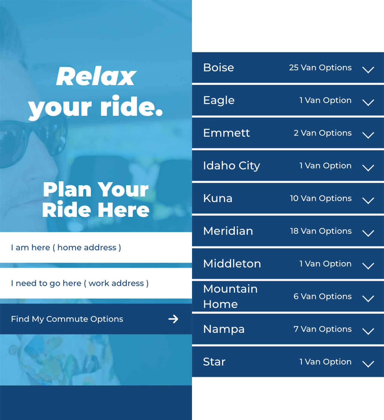
The site was designed for phones first and tested on iOS and Android.
Accessibility and security held to a government standard
We designed to WCAG 2.2 AA from the first comp. Before launch we tested with Google Lighthouse, Siteimprove, our own accessibility crawler Wha11y, and NVDA and Android TalkBack screen readers. ACHD received a written accessibility report with the site.
ACHD's IT team reviewed and approved every plugin before development began. Staff sign in to WordPress with their existing ACHD accounts through single sign-on with two-factor authentication, so website access follows the same rules as the rest of ACHD's systems.
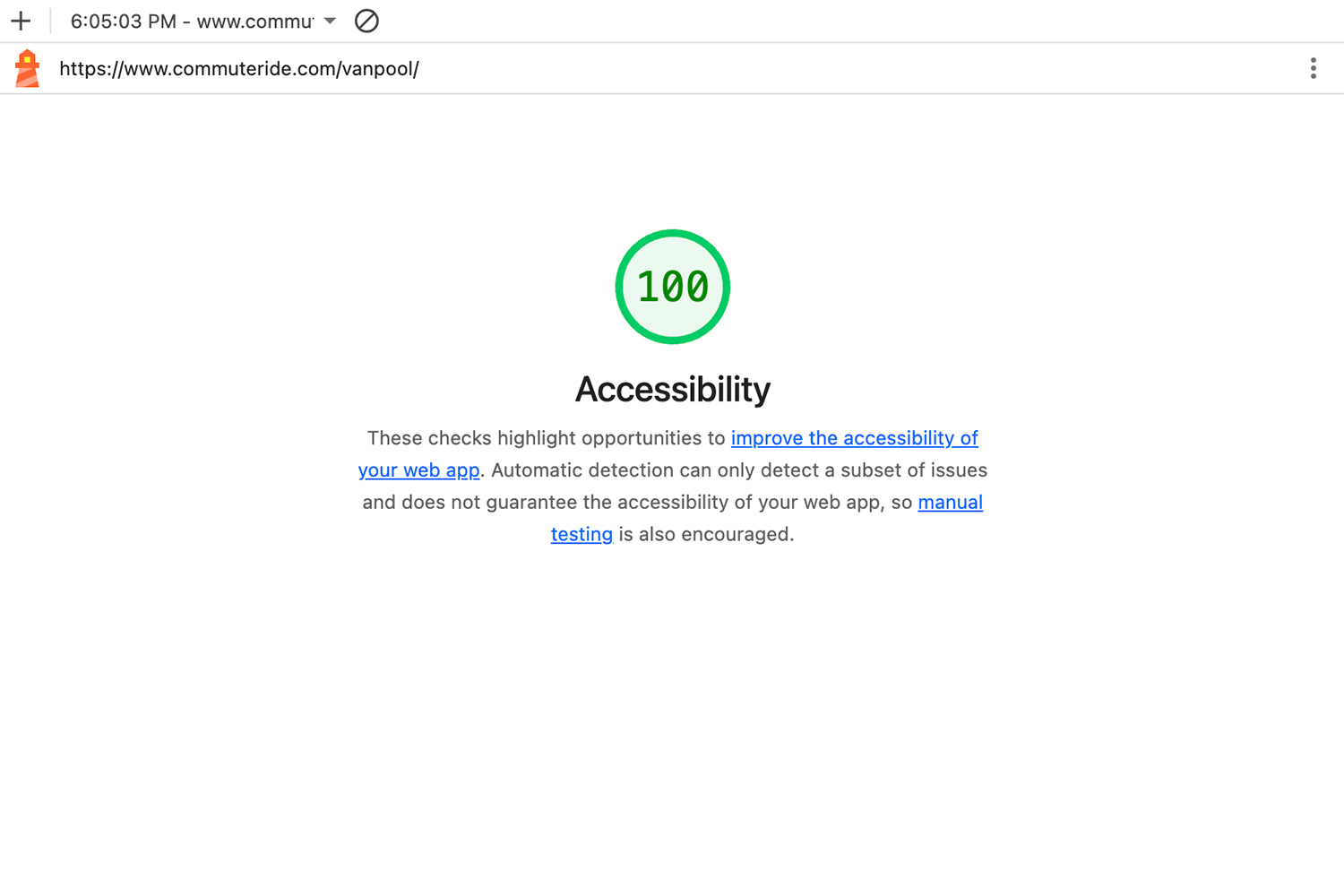
Google Lighthouse accessibility score of 100 on the vanpool page.
Results
The new commuteride.com went live on schedule on September 29, 2026.
- 132 pages reduced to 30, a 77% reduction
- Google Lighthouse accessibility score of 100 on 8 primary pages, with WCAG 2.2 AA checks in Siteimprove and Wha11y
- One vanpool inquiry form in place of several, connected to the CRM
- Analytics and a reporting dashboard in place from the first day, so ACHD has a baseline for every future campaign
What This Means for Similar Organizations
If your organization runs several programs and your website lists them like a directory, your visitors are doing sorting work the site could do for them.
- Start with the visitor's question. Commuteride's is "where are you going?" A parks department's might be "what do you want to do this weekend?" and a permit office's might be "what are you building?"
- Cut pages before you design. Retiring 102 pages made the 30 that remain easier to find, maintain, and keep accessible.
- Bring IT in at the start. Plugin review and single sign-on take coordination, and starting both in discovery kept them from holding up the build.
- Treat accessibility as a design requirement. Testing only at the end finds problems when they cost the most to fix.
If your website needs to help people make a decision, we can help.